 Edgar de Wit
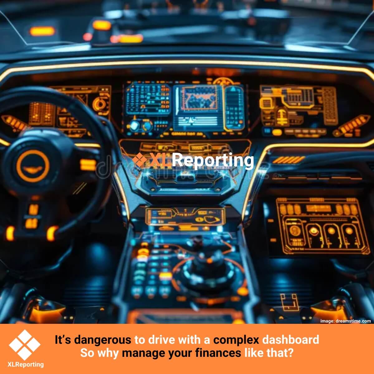
If you would have a car with a super complex dashboard, you would crash into a tree every time you simply want to check your speed.
So why put up with complex dashboards to manage your finances?
If you work in the world of financial reporting, dashboards, and KPIs, you've probably heard it all. Stories of organizations investing heavily in dashboards. And it makes sense: once your data is aligned and consolidated, the fun begins—building visual dashboards. Software tools offer countless features: custom layouts, advanced filters, dynamic visualizations, and more. And when you have those options, you want to use them all.
But here's the catch: the more features you use, the higher the risk of losing focus. What do you actually need to see in a dashboard? And what are you going to do with those insights?
The honest and boring truth is: a good dashboard should be simple. It should communicate clearly at a glance. That means making choices. Not just what you show, but how you show it.
That's why dashboards in XLReporting are designed to be as simple and effective as possible. We've stripped out most of the setup complexity and let the software decide the best format based on your data. That frees you up to focus on what matters: what should appear on your dashboard. Or even better—create multiple dashboards, each from a different angle.
Let’s take a look at a real-world example: our standard dashboard.
Our default dashboard is built around five key components:
That’s it. On one A4 dashboard, you instantly see where you stand, per company or across the entire group.
Back to the listSchedule a Meeting with one of our Planning and Reporting Experts.
Let's TalkXLReporting is an online Planning and Reporting Platform to create reports, budgets and forecasts the way you want.
![]()
![]()
![]()
![]()
© 2009-2026 XLReporting
® All rights reserved
