How to use the menu
XLReporting can be used on desktop, tablet or mobile, as long as you have an internet connection and a modern web browser with Javascript enabled.
On Desktop
The standard page layout and menu on a desktop-sized screen are as follows (watch the tutorial video):
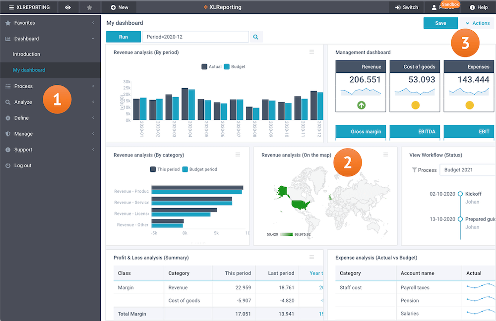
By clicking on any item, you can open all options within that section:

You can collapse (minimize) the menu by clicking on ☰ XLReporting in the left-top. This will maximize the report area. Clicking again will restore it to the way it was. This setting will automatically be remembered for you.

On Tablet and Mobile
XLReporting is fully supported on mobiles.
On a mobile or tablet (below a screen width of 800px) the menu will automatically convert into a mobile-style menu. In mobile mode, the Define and Manage options are not available.
