Create | Settings | Define | Fields | Convert | Select | Selections | Layouts | Sort order | Actions | Import | Print/PDF | API access | Power query | Review | Dashboard
Define reports
Reports are configurable objects that define how information from your data sets will be presented into reports and charts. You can give each report a name, define the source data, report fields, conversions, selections, create multiple layouts, and set user permissions. You can choose from over 30 different layout types.
Once created, you can run reports as often as you want. They will always show the latest data.
You can also watch the tutorial video.
When you sign up, your tenant already has a number of predefined reports, aimed at financial reporting. They contain example data of a fictitious company. You don't have to start from scratch, you have working examples which you can start with, and you can add or change reports at any point in time.
Some common examples of reports are:
- Profit & Loss report
- Balance sheet
- Cashflow projection
- Sales report by customer
Create a report
You can create a report in two ways (watch the tutorial video):
- Click on Define - New in the sidebar menu, or click the New button in the top of the screen.
- Click on the Actions - Create new button of an existing report. This also enables you to make a copy of an existing report.
Either way, the rest of the process is the same, and you can enter a name for your new report, set user permissions for it, and define its fields and layouts. At every change, the preview of the report will be automatically updated:
Settings
You can define the settings for the report via these fields:
- Name - enter a name. This must be unique within all your reports.
- Group - select how this report is to be shown in the menu navigation.
- Active/locked - activate or lock a reports. When locked, this report is not visible in the menu, and the report can not be run.
- Source data - select the source data set. This is the primary data set for your report, all linked data sets will automatically be included as well.
- User roles - select one or multiple user role(s) to restrict access to this report. If you leave this blank, all users have access.
- Sort - define an (optional) sort order (1-9999) that determines where this report is displayed in the menu. If you leave this blank, the report is ordered alphabetically.
- Description - enter an (optional) description to explain the use of this report to users. The text can contain basic html tags to format your text (e.g. <br> for a next line, <b> for bold text). The text can also contain functions to include dynamic information or images in the text.
- Script - create a script to process the source data before the report is generated. This option is for advanced use, and only visible if your user role has the relevant permissions. Read more about scripts.
Define
You can define the fields and layouts by clicking on the Define button:
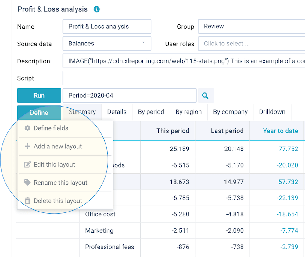
This opens a dropdown menu with further options:
- Define fields - select the fields that you want to include in this report, and (optionally) define custom field names, conversions, calculations, and data selections.
- Add new layout - add a layout to this report.
- Edit this layout - edit the currently selected layout.
- Rename this layout - rename the currently selected layout.
- Delete this layout - delete the currently selected layout.
Define fields
By default, reports will include all columns from the source data set and its linked data sets, without any conversions or data selections.
Optionally, you can click on Define - Define fields to include or exclude data set columns, rename fields, convert field values, calculate, or to define data selections:
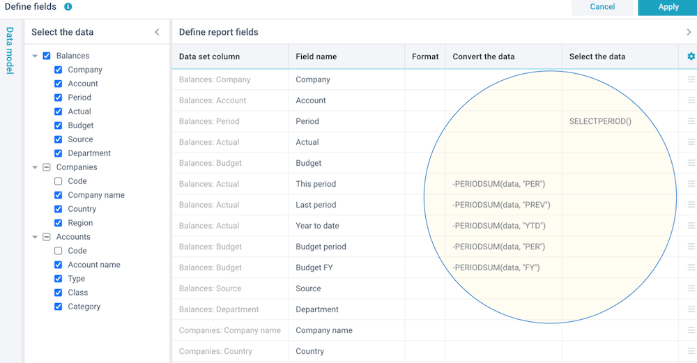
You are free to rename fields for the purpose of this report, without impact on the source data sets or any other reports.
To insert, delete, copy, or move fields, you can either right-click on a row, or click on the ☰ button in the last column of a row. You can create 2 types of fields:
- Source field - this refers to a data set column. You can use the reserved word data to refer to its content if you want to convert or select this data.
- Calculated field - this does not have its own source. You need to provide a static value, a formula, a function, or an expression on other fields to give this field some value.
In the above example, we have created 2 calculated fields: one to calculate a variance between 2 other columns, and another one to calculate the variance as a percentage.
You can optionally set a specific format for fields with numeric values. If you leave this blank, the field values will be formatted to 0 decimals.
You can also watch the tutorial video.
- You can enter the full field names in the Convert the data and Select the data columns. They are not case-sensitive. XLReporting will match them to data set columns and report fields and enclose them in brackets e.g. [Actuals]. If this produces the wrong results, you can place the field names between brackets yourself.
- You can create multiple calculated fields but alway use the source fields, and avoid chained calculations (i.e. one calculated field using the outcome of another calculated field).
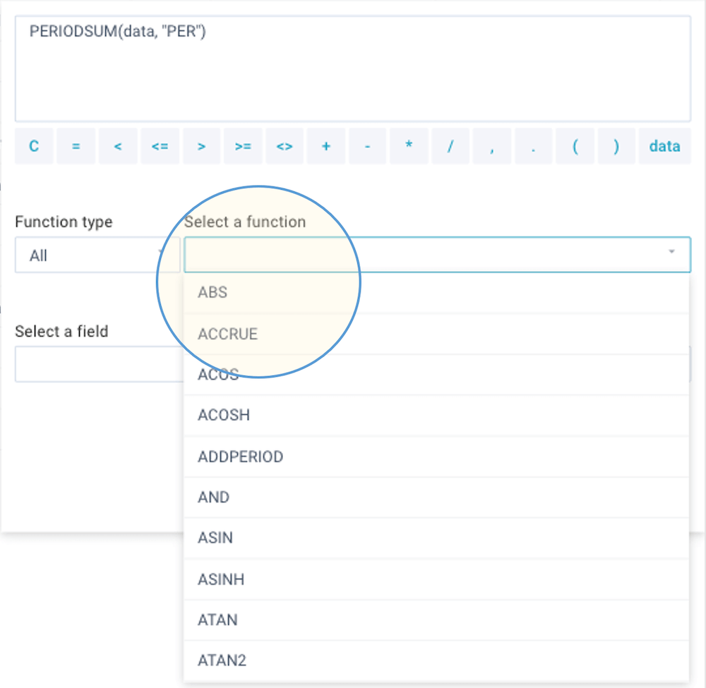
Convert or calculate data
You can convert or calculate field values in your report. You can enter a simple function or an expression with multiple functions and operators. There are many functions you can choose from:
An expression can contain the following elements:
- The reserved word data - this is a placeholder for the current value of the
selected field. Use this every time you want to refer to the current value in an expression.
For example, to multiple the field value by 100:
data * 100 - Field names in the report - simply type the field name. For example, to
substract the Credit field from the Debit field:
Debit - Credit - Functions - you can choose from a large
collection of functions with the same syntax as in Excel to perform a large
variety of text, data, and number operations. Some examples:
ROUND(Amount, 2)
LEFT(data, 20)
IF(Unit = "Actuals", Amount, 0) - Static values - you can use any static value in your expression. When using
text values, these must be enclosed by " (= double quote) characters. Some examples:
data / 1000
data + " some added text"
IF(data = "Sunny", "warm", "cold") - Operators - you can use all common mathematical operators, such as: + - * /
and you can use brackets ( ) to control the sequence of operations. For example, to
substract the Credit field from the Debit field, divide it
by 1000, and then round the result to 0 decimals:
ROUND(Debit - Credit) / 1000, 0)
You can also watch the tutorial video.
- You can create multiple calculated fields but alway use the source fields, and avoid chained calculations (i.e. one calculated field using the outcome of another calculated field).
- XLReporting will automatically aggregate data based on the fields that are selected in a given report layout. In other words: the retrieved data matches the "visible" presentation, without having to retrieve all underlying records. This allows for optimal speed even with large volume of underlying data. Be aware this may have an impact on your calculations if you use multiplication or division of multiple fields: these may give different results when applied to aggregated data versus detailed data. If you want to ensure that a field is always included in the detail, even if it is not included in the report layout, use the DISTINCT(data) function in the convert field. This will instruct XLReporting to include all distinct values in this field (and all associated level of detail) in the data. Be aware that this will cause more detail data to be retrieved, making the report slower.
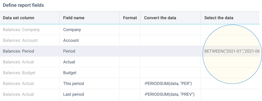
Select the data
You can select the data in your report. Selection means that you can include only certain rows in your source data in the actual report. You can specify a static value, a single function, or an expression with the standard operators. You can also use these filter functions: BETWEEN, CONTAINS, ISANY, ISBLANK, AND, OR, NOT. For more information, see filter functions.
In below example, we are selecting only a range of financial periods:
You can also watch the tutorial video.
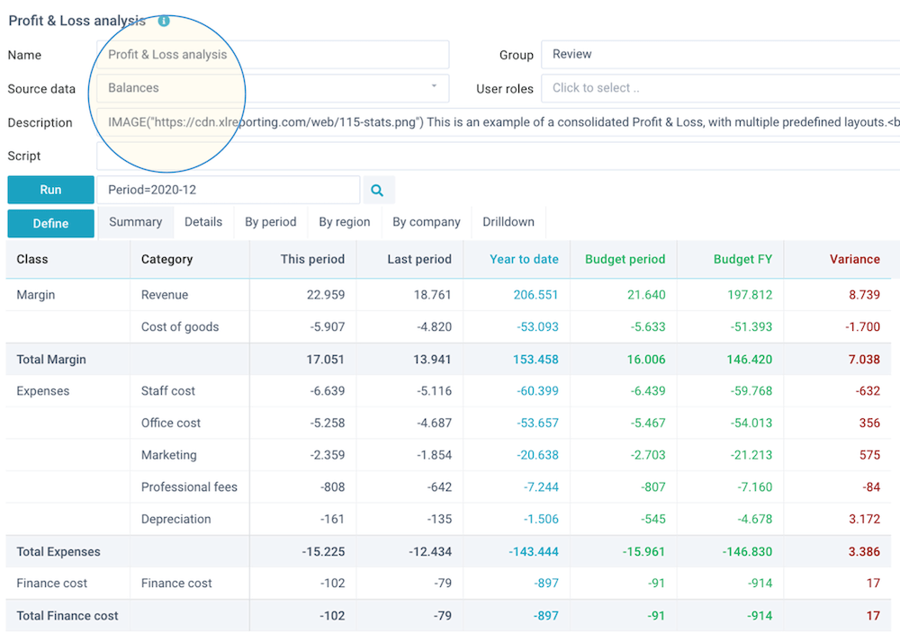
User selections
In many cases you might want the user to select some value when they start a report. For example, the company or the period. You can do that by using the SELECT() or the SELECTPERIOD() function:
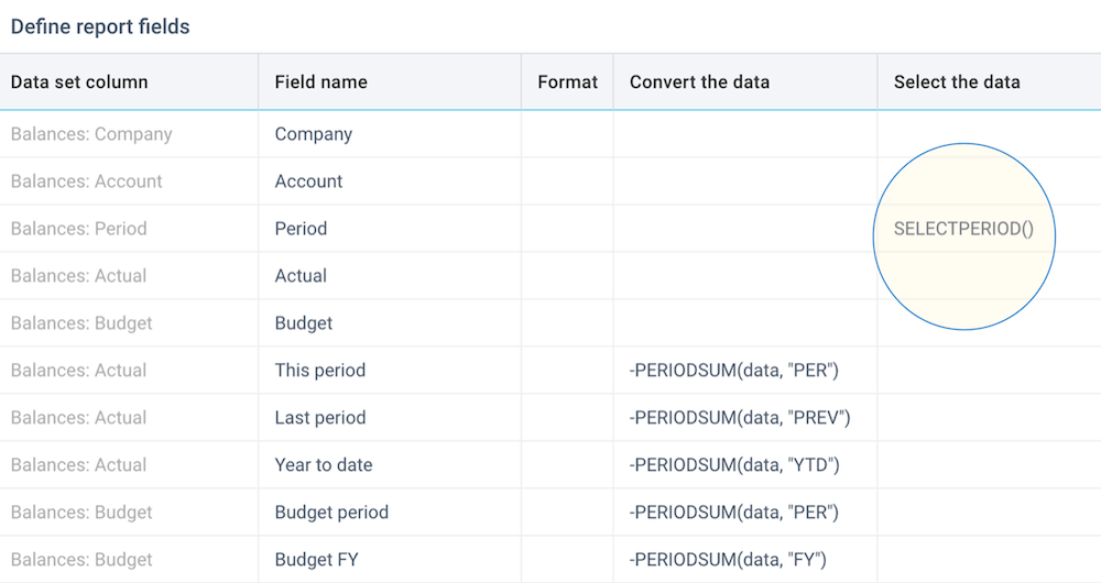
This will present the user with a list of values to select from, before the report is generated.
If you use the SELECTPERIOD() function in combination with the PERIODSUM() function, you can build powerful and dynamic period-discrete and year-to-date calculations with just a few clicks. Read more about period conversion functions.
You can also watch the tutorial video.
Layouts
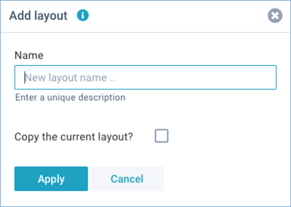
Click on Define - Add layout or Define - Edit layout. For every layout, you can enter a name:
It is easy to edit a report layout, simply by dragging fields into the various areas of a report.
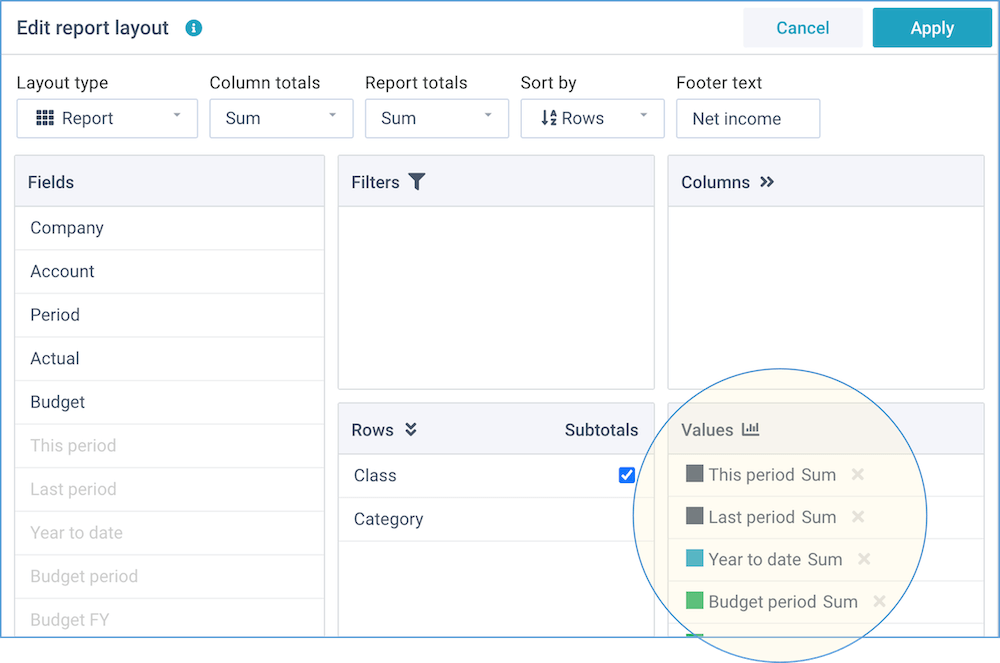
This window enables you to change the report options and the fields position.
Report options
These are settings that determine the overall appearance of the report layout:
- Layout type - report, compact, sparklines, chart, treemap, diagram
- Chart type - column, column (stacked), column (with line), column (combi), bar, bar (stacked), line, line (smooth), pie, pie (3D), donut, donut (KPI), area, area (smooth), area (stacked), radar, scatter, gauge, bullet, scorecard, geo chart, timeline
- Column totals - sum, average, variance, variance (-), or none
- Report totals - sum, average, result, result (-), or none
- Sort by - sort either on the descriptions in the row fields (if you select multiple Row fields, these will all be included in the sort operation), or on the values in the report
- Options - dependent on the selected layout type, you can enable the
following options:
- Totals first - show the column totals before the data columns
- Incremental - calculate the incremental value (difference) between subsequent column values (converting cumulative column values to distinct values)
- Cumulative - calculate the cumulative totals from subsequent column values (converting distinct column values to cumulative values)
- Fin subtotals - insert extra subtotals in Profit & Loss and Balance Sheet reports: "Gross Profit", "Earnings before Interest & Tax", "Total Assets", and "Total Equity & Liabilities". In all other reports, this option will be ignored
- Hide zeros - for reports, hide rows that only have zero values
- Collapse - for pivot reports, collapse all rows
- Show grid - for charts, show horizontal grid lines
- Hide values - for charts, hide the values on the axis
- Reverse values - for charts, reverse the data values
- Labels for totals - you can optionally provide 1 or more labels for the report totals, column totals, and subtotals. By default, the totals are given an automated label based on the selected operation (e.g. Total, Average, Variance etc). You can optionally specify a custom label. For example, instead of the default "Total" you might want to show "Net result" as a report total. This field can contain up to 6 labels (Report totals, Column totals, Subtotals, Fin subtotals 1-3), separated by a comma, and they are all optional
- Zones - for the chart types "gauge", "bullet", and "scorecard", you can optionally enter the % values for the 3 zones (green, orange, red), separated by a comma (zones are used when comparing 2 value fields)
- Goals - for the chart types "gauge", "bullet", and "scorecard", you can optionally enter the absolute value for target, and (optionally) the mininum and maximum values, separated by a comma
You can choose from over 30 different layout types.
You can also watch the tutorial video.
- revenue, sale, turnover, income
- depreciation, amortization, amortisation
- interest, tax, finance, extraordinary
- equity, capital, liability, liabilities, provision, debt
Fields position
You can manually drag-and-drop any of the available fields into any of the report areas, and if you no longer want a field in your report, you can simply drag it out again.
- Fields - this shows all fields that are available within this report.
- Filters - drag fields here that you want to use as dynamic filters. They will be shown above the report with automatic lists of values. Whenever you select a different filter value, the report will be immediately updated to reflect this.
- Rows - drag fields here that you want to lay out into rows. This is the main dimension of your report. You can create a grouping in your report by dragging multiple fields here, and move them into the desired order. For the standard layout type, you can also indicate where you want subtotals.
- Columns - drag fields here that you want to lay out into columns. Usually, these are fields that contain a period, date, or time. By including one or more fields into columns, you can create two-dimensional reports.
- Values - drag fields here that you want to summarize on. Usually,
these are number or amount fields. Once you have dragged a field here, you can click on it
to select the color and the type of operation.

You can choose from these operations:- Sum - the sum of all values (non-numeric values are ignored).
- Count - the number of values that are not blank (values can be numeric or text). Please note that this counts the visible items in the report, and not all items in the underlying data.
- Average - the average of all values (non-numeric values are ignored).
- Distinct - the sum of distinct values in the underlying data.
- Minimum - the smallest value (values can be numeric or text).
- Maximum - the largest value (values can be numeric or text).
- Percentage - the percentage (%) that each value makes up of the report total (non-numeric values are ignored). The report total is always 100%.
- Incremental - the incremental value (difference) between the rows.
- Cumulative - the cumulative value for every row.
You can also watch the tutorial video.
Sort order
By default, reports are sorted alphabetically on the values in the row and column fields. You can specify a custom sort order in the underlying data sets that are used as rows and column fields. Simply prefix the field values with a number followed by a colon (e.g. "1:text"). XLReporting will sort all reports on that prefix, but the prefix will not actually be shown in the report. This enables you to centrally set a sort order that is consistent across all reports.
Actions
When defining a report, you can use the Save and Actions buttons in the right-top of the screen:
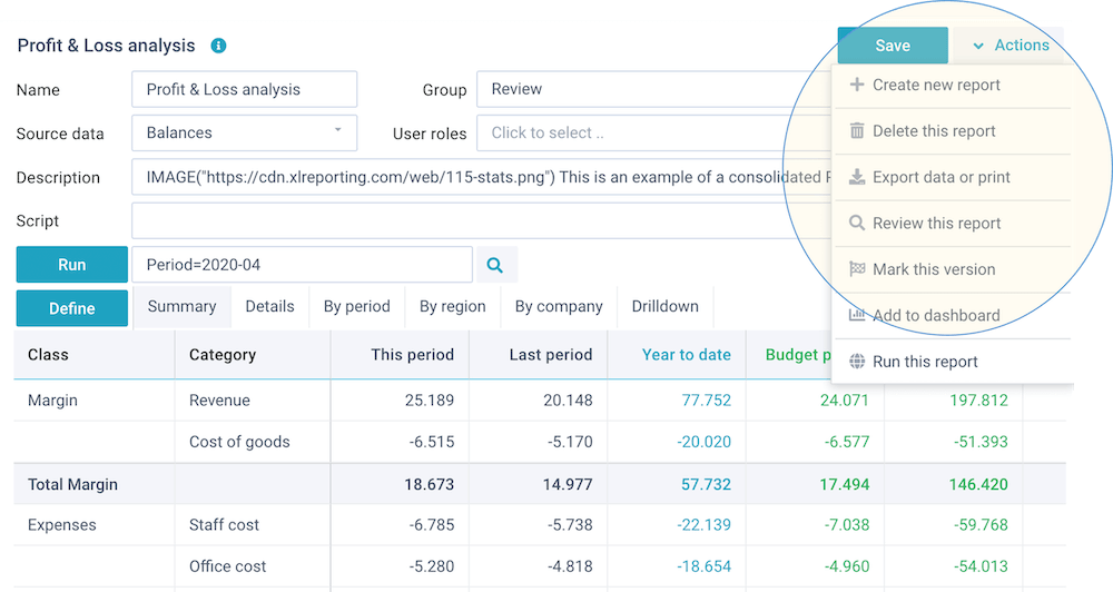
These buttons enable you to do the following:
- Save - save your changes (or Ctrl+S)
- Actions - open a dropdown menu with further options:
- Create new report (or copy one)
- Delete this report
- Import from object
- Preview and test
- Get API access
- Export data or print
- Review this report
- Mark this version
- Add to dashboard
- Run this report
Please note that the list of actions is dependent on the permissions (in your user roles) that you have been given.
Import from object
If you have the relevant permissions, you can import the defined fields or individual layouts from another report in an configuration export file from Transfer Objects. This function requires the same data sets in this tenant as in the configuration file you are importing. You should check your import carefully. If in doubt, you can always (re)import the entire report via Transfer Objects.
Print and PDF export
You can export the report to multiple file types, to a PDF file, or print it.
XLReporting will automatically fit the content to the available page width.
Get API access
You can retrieve data from reports through our API, and send it straight into another system or even directly into Excel or PowerBI.
Please note that this option is only visible if your user role has Access API permission.
Click on Actions - Get API access for instructions, properties, and examples:

XLReporting provides the following API methods:
- Get all data - returns the data content of the report.
- Power query - creates a file that you can open in Excel or PowerBI to establish a direct and realtime connection to the report.
You need to provide a valid API token with all requests. Tokens are linked to users, and you can request a token through Manage - Profile - Actions.
Read more about API integration.
- Be cautious when you enable API access. Only do this when you are really using API calls and always use the "principle of least privilege".
- API tokens are valid for 360 days, but will expire immediately when you revoke or renew your token, or when your API permissions or user account are deleted.
- You will be timely notified by email when your token is due to expire.
Power query
In addition to exporting reports to Excel, you can also access reports directly from
Excel or PowerBI using Power queries. This enables you to design your own reports in Excel or
PowerBI using realtime data from XLReporting. The data will be automatically refreshed at any
time without you having to login to XLReporting.
XLReporting creates a small file
for you specific to each report, which you can open in Excel via Data - Get external
data.
You can choose to store your API token and selected
values in the file, or leave them as runtime parameters.

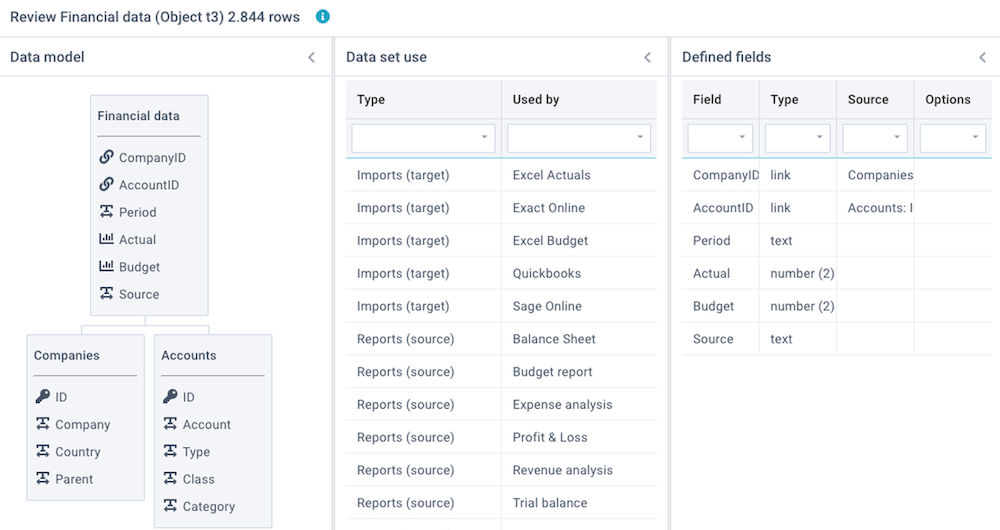
Review this report
Click on Actions - Review this report to review a number of aspects of this report and its source data set:
- Data model - shows a diagram with all linked data sets. This is derived from columns that are set to data type Linked values.
- Linked objects - shows all linked imports, reports, and models that are using this data set, and the total number of data rows in this data set.
- Linked data - shows the results of checks on the Key values and Linked values that are used to link data sets. Because linked values need to correspond with key values, this integrity check is important.
- Defined fields - shows a summary of all defined columns and data types.
- Recent activity - show all recent user activity relating to this data set.
You can also watch the tutorial video.
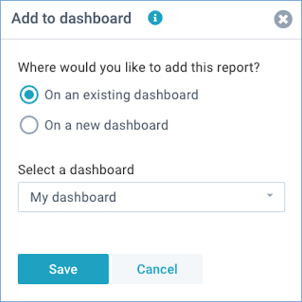
Add to dashboard
A dashboard is a personal page with your own favorite reports and models. You can create multiple dashboards, and each dashboard can contain multiple reports or models.
Click on Actions - Add to dashboard to add this report to either a new dashboard, or to a new dashboard (watch the tutorial video):