Define report layouts
Layouts are different "views" on your data within the same report. Reports can contain multiple layouts.
Some common examples of layouts are:
- Sales by customer
- Sales by product group
- Sales by country
- Sales by month
You can also watch the tutorial video.
Layout types
You can choose from over 30 different layout types. They fall into 6 main categories:
Report
The default layout shows information grouped in sections with subtotals.

Drilldown
This layout shows aggregated multi-dimensional information which you can drill into.

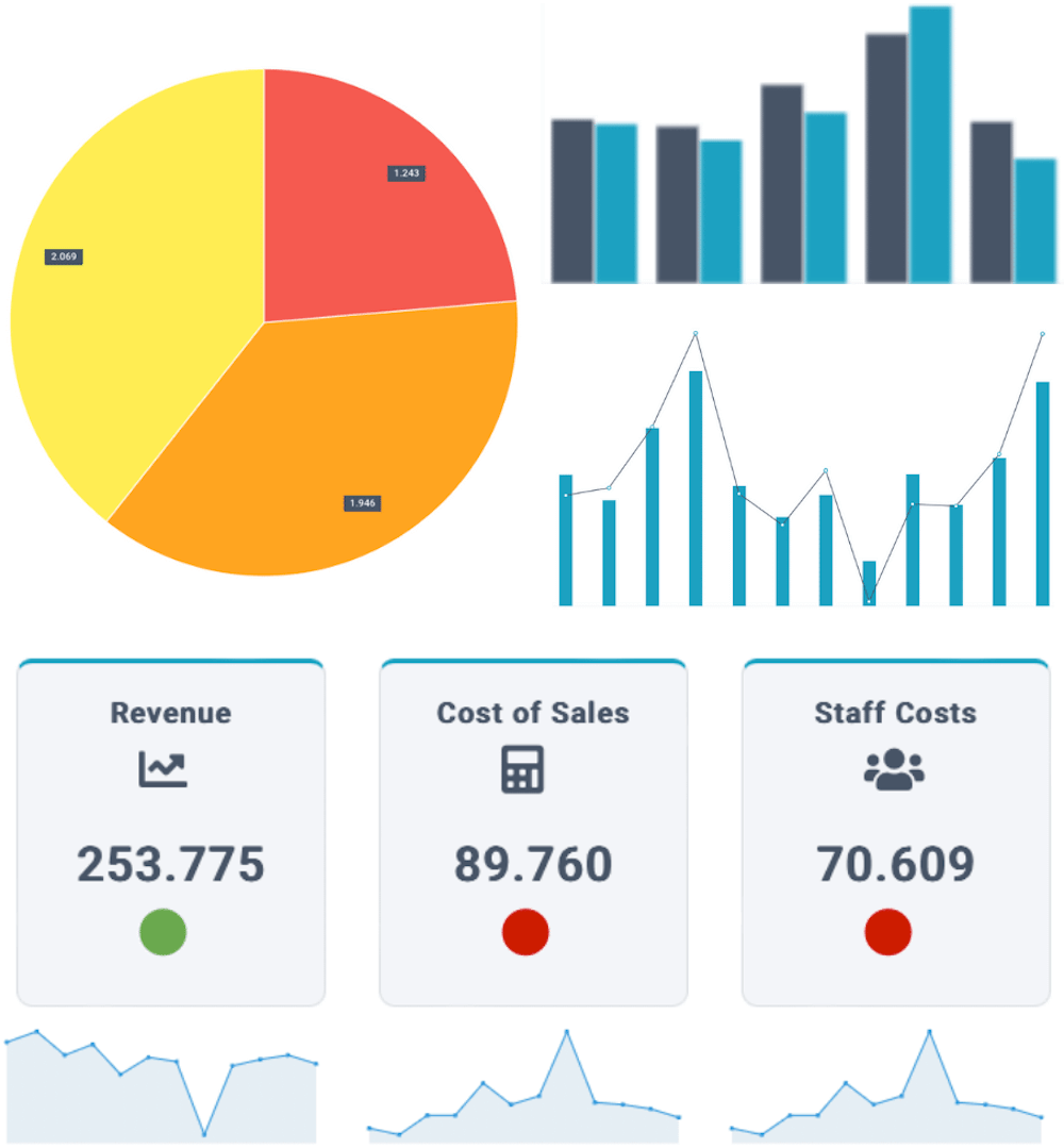
Sparklines
This layout shows the development of givens item over a period of time, which is useful to understand trends at a high level.

Charts
This layout includes all common graphs, such as column, bar, line, pie, donut, donut (KPI), area, radar, scatter, geo chart, gauge, bullet, scorecard, and timeline.

Treemap
This layout shows data in a hierarchical structure using nested rectangles with relative sizes. For example, revenue by region can be represented this way.

Diagram
This layout shows in a hierarchical structure. For example, salary cost by department or revenue by region can be represented this way.

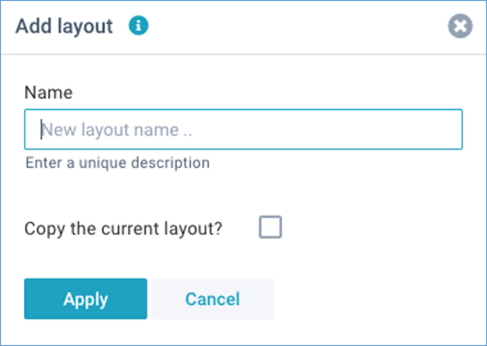
Create a layout
Click on Define - Add layout. For each layout, you can enter a name and choose whether or not copy the current layout:
You can edit a report layout by simply dragging fields into the various areas (watch the tutorial video):
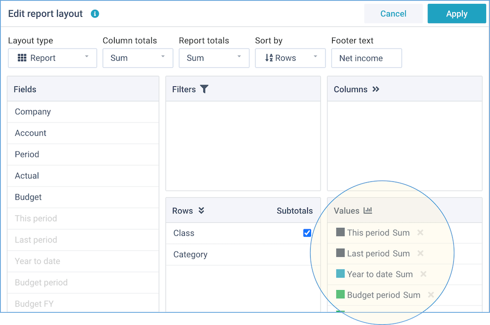
This window enables you to change the report options and the fields position:
Report options
These are settings that determine the overall appearance of the report layout:
- Layout type - report, compact, sparklines, chart, treemap, diagram
- Chart type - column, column (stacked), column (with line), column (combi), bar, bar (stacked), line, line (smooth), pie, pie (3D), donut, donut (KPI), area, area (smooth), area (stacked), radar, scatter, gauge, bullet, scorecard, geo chart, timeline
- Column totals - sum, average, variance, variance (-), or none
- Report totals - sum, average, result, result (-), or none
- Sort by - sort either on the descriptions in the row fields (if you select multiple Row fields, these will all be included in the sort operation), or on the values in the report
- Options - dependent on the selected layout type, you can enable the
following options:
- Totals first - show the column totals before the data columns
- Incremental - calculate the incremental value (difference) between subsequent column values (converting cumulative column values to distinct values)
- Cumulative - calculate the cumulative totals from subsequent column values (converting distinct column values to cumulative values)
- Fin subtotals - insert extra subtotals in Profit & Loss and Balance Sheet reports: "Gross Profit", "Earnings before Interest & Tax", "Total Assets", and "Total Equity & Liabilities". In all other reports, this option will be ignored
- Hide zeros - for reports, hide rows that only have zero values
- Collapse - for pivot reports, collapse all rows
- Show grid - for charts, show horizontal grid lines
- Hide values - for charts, hide the values on the axis
- Reverse values - for charts, reverse the data values
- Labels for totals - you can optionally provide 1 or more labels for the report totals, column totals, and subtotals. By default, the totals are given an automated label based on the selected operation (e.g. Total, Average, Variance etc). You can optionally specify a custom label. For example, instead of the default "Total" you might want to show "Net result" as a report total. This field can contain up to 6 labels (Report totals, Column totals, Subtotals, Fin subtotals 1-3), separated by a comma, and they are all optional
- Zones - for the chart types "gauge", "bullet", and "scorecard", you can optionally enter the % values for the 3 zones (green, orange, red), separated by a comma (zones are used when comparing 2 value fields)
- Goals - for the chart types "gauge", "bullet", and "scorecard", you can optionally enter the absolute value for target, and (optionally) the mininum and maximum values, separated by a comma
You can choose from over 30 different layout types.
Fields position
You can manually drag-and-drop any of the available fields into any of the report areas, and if you no longer want a field in your report, you can simply drag it out again.
- Fields - this shows all fields that are available within this report.
- Filters - drag fields here that you want to use as dynamic filters. They will be shown above the report with automatic lists of values. Whenever you select a different filter value, the report will be immediately updated to reflect this.
- Rows - drag fields here that you want to lay out into rows. This is the main dimension of your report. You can create a grouping in your report by dragging multiple fields here, and move them into the desired order. For the standard layout type, you can also indicate where you want subtotals.
- Columns - drag fields here that you want to lay out into columns. Usually, these are fields that contain a period, date, or time. By including one or more fields into columns, you can create two-dimensional reports.
- Values - drag fields here that you want to summarize on. Usually, these are
number or amount fields. Once you have dragged a field here, you can click on it to select
the color and the type of operation.

You can choose from these operations:- Sum - the sum of all values (non-numeric values are ignored).
- Count - the number of values that are not blank (values can be numeric or text). Please note that this counts the visible items in the report, and not all items in the underlying data.
- Average - the average of all values (non-numeric values are ignored).
- Distinct - the sum of distinct values in the underlying data.
- Minimum - the smallest value (values can be numeric or text).
- Maximum - the largest value (values can be numeric or text).
- Percentage - the percentage (%) that each value makes up of the report total (non-numeric values are ignored). The report total is always 100%.
- Incremental - the incremental value (difference) between the rows.
- Cumulative - the cumulative total for every row.
You can also watch the tutorial video.
Zones
The chart types gauge, bullet, and scorecard have a different purpose from the other chart types. Instead of showing series of data, their purpose is to show one single data point, relative within a certain scale. For example, actual revenue as a % of budget revenue.
The recommended use is to calculate a percentage value in your report, and show that in these chart types. By default, XLReporting assumes your value fits within a scale from 0% to 199%, using 3 default zones (at 70, 90, and 110) to color the chart:
- Red: <70%
- Orange: 70-90%
- Green: 90-110%
- Blue >110%
You can also define your own zones, entering the 3 % treshold values in the Zones field, separated by a comma. For example: "50, 70, 90" sets the zones at 50%, 70%, and 90%.
By default, the colors red, orange, green, and blue assumes that the value is "the higher, the better". For example, this applies to revenue. However, you can also reverse the zones, for expense for example: "the lower, the better". To achieve this, you would enter "110, 90, 70".
Using percentages enables you to compare different measures in a meaningful way, regardless of their absolute size. However, you can also show absolute measurements by entering the appropriate zones. For example "20000, 40000, 60000" sets 3 zones with absolute values.
Goals
For the chart types gauge, bullet, and scorecard you can also define absolute values for a target, as well as a minimum and maximum value. For example "70000, 0, 90000" defines 70000 to be the goal within a (minimum and maximum) scale between 0 and 90000.
